

Humane Design System

Humane Design System for The ICC Ecosystem

by Prashant Pandey
v1.0 · August 2026 ICC · Ideas Create Change Brand book + components
02 · Get Started

About this system

A brand book and a component source in one document. It exists so every ICC product stays visually and verbally consistent without re-deciding the basics each time.

What it is

Two things at once. A brand book, voice, logo, colour, motif, the rules that make ICC recognisable. And a component source, the tokens, states and specs the Figma library and every product build read from.

Why it exists

Consistency across every ICC product without re-deciding the basics each time. Colour, spacing, type and copy tone are settled here so the work upstream can be about the actual problem.

Built from three tiers
TIER 1
Core tokens
Nine hex values, two typefaces, one mark. Locked.
TIER 2
Semantic tokens
Role names like action-primary. Components consume these.


TIER 3
Site theme
Each product remaps semantics to its own job. Detailed in Brand Across Products.
Why this exists

“A system exists so the fiftieth decision is as fast as the first.”

02b · Get Started

Libraries & downloads

Where the system lives outside this document, the brand kit, the Figma component library, and the token set.

03 · Foundations

Design tokens

The master reference. Every other page links back here. Read as data, not prose, these are the values, verbatim.

Colour 9 tokens · all active

Token
Hex
Role
Weight
{{ c.name }}
{{ c.hex }}
{{ c.role }}
{{ c.weight }}

Radius

{{ r.name }}
{{ r.val }}
{{ r.use }}

Elevation

{{ e.name }}
{{ e.shadow }}
{{ e.use }}

Spacing base unit 4px

{{ sp.name }} {{ sp.val }}

Motion

fast 120ms, hover
base 200ms, default
slow 320ms, modal / panel entrance
ease-out entrances · ease-in exits · ease-in-out looping
Always respect prefers-reduced-motion.

Typography

{{ t.level }}
{{ t.desk }}
{{ t.mob }}
{{ t.weight }}
Desktop · Mobile · Weight. Cabinet Grotesk for display, Satoshi for body and UI.
04 · Foundations

Colour system

All nine colours are in active use. Terracotta carries every error state, Sage every success, Ink every body text on light, Pearl every elevated surface.

{{ c.name }} {{ c.weight }}
{{ c.hex }}
{{ c.role }}

Semantic mapping

Components never reach for a hex. They ask for a role, and the role resolves to one of the nine.

{{ sm.role }}
{{ sm.token }} {{ sm.hex }}
{{ sm.use }}

Approved pairings & contrast

Measured ratios. Body = WCAG AA 4.5:1 for text under 24px. Large / UI = 3:1 for 24px+, bold 18.66px+, and non-text UI boundaries.

Sample
Pairing
Ratio
Body
Large
Aa · sample text
{{ k.fgName }} on {{ k.bgName }}
{{ k.ratio }}
{{ k.body }}
{{ k.large }}
Working rule

Terracotta, Soft Blue and Sage don’t clear 4.5:1 on cream. Use them as borders, icons, badge fills and 24px+ type, and let Ink carry the sentence. An error message reads in Ink with a Terracotta border and icon, not Terracotta prose at 14px.

Why this exists

“Nine colors, not five, restraint was never the point, intention was.”

05 · Foundations

Typography

Cabinet Grotesk for display. Satoshi for everything you read. The ramp below is rendered at actual size, desktop on the left, mobile on the right.

{{ t.level }} {{ t.desk }} desktop · {{ t.mob }} mobile
{{ t.family }} · {{ t.weight }}
{{ t.sample }}
Desktop
{{ t.sample }}
Mobile

Responsive behaviour

{{ demoWLabel }} → H1 {{ h1px }}
02 · Logo and usage
Ideas Create Change
H1 scales 40px → 64px between the 375 and 1440 breakpoints. Body stays 16px at every width, reading size doesn’t shrink on a phone.
Pairing rule

Cabinet Grotesk Bold or ExtraBold for display moments only. Satoshi Regular or Medium for all body, captions and UI labels.

Never mix weights within one heading hierarchy. No system-default stack in visible type, if the brand faces fail to load, the fix is the font pipeline, not a fallback.

06 · Foundations

Spacing & layout primitives

A 4px base unit, three layout primitives, one grid. Every gap in this document is a value from the scale below.

The scale

{{ sp.name }}
{{ sp.val }}

Primitives

Three containers cover almost every layout in the system. If a layout needs something else, that is a signal to simplify the layout.

Stack
Vertical rhythm container. One gap value governs the whole column.
gap: space-75
Inline
Horizontal flex row. Wraps rather than overflows. Never spaced by whitespace.
gap: space-75 · wrap
Box
Padded container. Padding always comes from the scale, never an ad-hoc number.
padding: space-150

Grid

12 columns · 24px gutter · 1200px max container

Breakpoints

375
Mobile, single column, sidebar behind hamburger
768
Tablet: 64px icon rail, expands as overlay
1024
Desktop: 280px sidebar expanded, collapse toggle available
1440
Wide, container caps at 1200px, gutters absorb the rest

Sidebar behaviour

This document’s own sidebar is the reference implementation, resize the window and watch it change. Collapse state persists for the session; it does not reset on navigation.

Desktop · 1024+
280px, expanded
Number + label. The collapse toggle docks it to a 64px rail and the content area reflows to fill the freed width.
Tablet · 768–1023
64px rail by default
Hover or tap expands it as an overlay above the content, the page never pushes or reflows.
Mobile · under 768
Hidden behind a hamburger
Opens as a full-height slide-in drawer over the content. Closes on item selection or outside tap.
Why this exists

“Spacing is the only part of a layout everyone notices and nobody names.”

07 · Foundations

Radius

Radius carries meaning here. Larger radius means larger surface, not decoration. Uniform rounding across every element is what makes a system read as templated.

{{ r.name }} {{ r.val }}
{{ r.use }}
08 · Foundations

Elevation & shadow

Every shadow in this system is tinted Deep Blue. Never gray, never black. This one decision does more to make the system feel designed rather than templated than almost anything else.

On Warm Neutral
{{ e.name }}
{{ e.shadow }}
{{ e.use }}
On Deep Blue
{{ e.name }}
{{ e.shadow }}
{{ e.use }}

On Deep Blue the shadow nearly disappears, that is correct. Depth on dark surfaces comes from the surface colour step (Deep Blue → Core Blue), not from blur. Reach for a border before reaching for a bigger shadow.

Why Deep Blue tint

A gray shadow on a cream page reads as dirt. The page is warm, so the shadow has to be a darker version of the light in the room, and in this system that light is blue. Tinting shadows to Deep Blue keeps the whole surface on one colour temperature, which is why cards here look placed rather than pasted.

09 · Foundations

Motion

Calm, measured, confident. No bounce, no elastic, no spin. Three durations cover the whole system.

Token
Value
Use
fast
120ms
Hover, colour shifts, tooltips
base
200ms
Default, lifts, toggles, toasts
slow
320ms
Modal and panel entrance
easing
ease-out in · ease-in out · ease-in-out looping
Live, hover and press these
Card lift
base 200ms · translateY(-2px)
Fade + slight rise
opacity 0 → 1, translateY(10px) → 0. Exits fade only, never reverse the rise.
Never

Pulsing, glowing, bouncing text, confetti, marquee. Press states darken and scale to 0.98 for 100ms, nothing in this system ever grows on interaction. All of it collapses to near-zero under prefers-reduced-motion.

10 · Foundations

Iconography

Line icons, 1.5px stroke, rounded caps, drawn on a 24px grid and usable at 16, 20 and 24px. This brand has almost no utility iconography, where a chevron or a close is genuinely needed, it looks like this.

Icon
16 · 20 · 24px
{{ ic.name }}

Semantic colouring

An icon takes the colour of its meaning, not its container.

Success
Sage #7A9E8A
Error
Terracotta #C4614A
Default
Deep Blue or Ink
Why this exists

This brand does not have an icon system, it has a shape system, the 12 motifs. Utility icons are a substitution, kept deliberately plain so they never compete with the motifs for personality.

11 · Foundations

Logo & usage

Four approved colour contexts. No other combinations. Each works at three sizes.

Primary
Deep Blue mark on Warm Neutral. The default.
Reversed
Warm Neutral or Soft Blue mark on Deep Blue.
White-only
White mark on Core Blue. Use at very small sizes.
On Amber
Deep Blue mark on Amber. Highlight contexts only.

Clear space

Equal to the width of the “P” in the wordmark, on all four sides. The dashed zone is the minimum boundary, nothing enters it.

Prashant
Pandey

Lockup: mark left, two-line stacked wordmark right. Never reflow the wordmark to a single line inside the lockup.

Format applications

Favicon
32 × 32px · white-only mark
Website logo
Mark + inline wordmark · 140px tall
Social profile
Circular crop · 400 × 400px
Do
  • Use on approved backgrounds only
  • Maintain aspect ratio when scaling
  • Keep clear space around the mark
  • Use the white-only mark at very small sizes
Don’t
  • Recolour outside the palette
  • Stretch, distort, or skew
  • Add drop shadows or glow
  • Place on busy or photographic backgrounds
12 · Foundations

Visual language

Twelve motifs derived from the mark. Illustration, dividers, backgrounds, texture. Always on-palette. Never decorative without purpose.

{{ mo.n }}
{{ mo.name }}
{{ mo.meaning }}

Motifs in practice

Three examples pulled straight from this document’s own build, the rule proved, not stated.
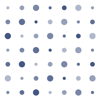
Dot Field at 20% behind a dense content block. It reads as paper texture, never as an object.
Dot Field · background texture · 20%
Section
opener
Pinwheel · H1 watermark · 12%
9
colour tokens, all active
Concentric Ring · behind a stat · 22%
Usage note

Motifs may be scaled, rotated or cropped, never distorted, never recoloured beyond the five core colours. Always at 12–30% opacity or scaled large enough to read as texture. A motif never competes with foreground text for contrast.

13 · Foundations

Voice & content design

“Someone who has done the work, thinking out loud.”

{{ v.trait }}
{{ v.meaning }}

Write like this / not like this

Write like this
{{ ex.good }}
Not like this
{{ ex.bad }}
Microcopy pattern library

The voice at the login screen

Empty states
“Nothing here yet. The first note you write shows up here.”
“No episodes published. Start with the conversation you keep coming back to.”
Error messages
“Couldn’t save, check your connection and try again.”
“That page moved or doesn’t exist.”
Confirmations
“Saved.”
“Subscribed. Edition 1 lands in your inbox on March 1.”
Button labels
Verbs, not nouns. “Save changes”, not “Submit”. “Send the note”, not “Confirm”. “Delete edition”, never just “Delete”.
Why this exists

“The voice traits mean nothing if they only apply to LinkedIn posts and stop at the login screen.”

14 · Foundations

Accessibility

This page sits in Foundations, not in a checklist at the end. Accessibility is a token-level decision, which is why it appears before a single component.

4.5:1
Body text contrast
Minimum for any text under 24px. Ink on Warm Neutral clears it at 15.8:1, that is the default pairing for a reason.
3:1
Large text & UI
24px+, bold 18.66px+, and every non-text boundary, borders, icons, focus rings, toggle tracks.
44px
Minimum tap target
44 × 44px, including the 32px Small button, its visual height is 32px, its hit area is not.

Focus states

A 2px Amber ring at 2px offset. Never removed with outline:none. Tab into the controls below to see it.

Motion sensitivity

Every animated token in this system respects prefers-reduced-motion: reduce. Durations collapse to near-zero; nothing is left mid-transition, and no information is carried by motion alone. Toasts still appear and still dismiss, they just stop sliding.

Colour is never the only signal. Every status badge carries a word, every error carries text, every success carries a label, the colour is confirmation, not the message.

15 · Foundations

Brand across products

One core that never moves, a semantic layer that translates it, and a theme layer each product owns. The dependency runs one way only.

Site theme
Owned per product
Each product remaps semantic tokens to its own job, density, accent emphasis, voice register, without ever touching core.
Semantic tokens
What components consume
Role-based names that point at core tokens. Components read these and never a raw hex.
action-primary action-hero surface-page surface-raised text-on-dark status-error
Core tokens
Locked forever
The nine hex values, the two typefaces, the mark. Nothing above this layer can change anything in it.
Dependency is one-way: theme reads semantic, semantic reads core. Nothing reads upward.

Site matrix

Site
Purpose
Voice register
Accent emphasis
Density
{{ st.site }}
{{ st.purpose }}
{{ st.voice }}
{{ st.accent }}
{{ st.density }}
Do
  • Remap semantic tokens per site
  • Adjust density and voice register to the product’s job
  • Adopt one suggested-extension colour as a product accent
Don’t
  • Introduce new core hex values
  • Change the logo’s approved contexts
  • Abandon the four voice traits
  • Mix multiple extension colours as competing accents on one product

16 · Components

Buttons

The hierarchy is locked. Amber is the hero CTA and appears once per screen at most, everyday primary actions are Deep Blue.

Live, one hero per screen

Variants & states

Amber fill · Hero CTA
One per screen, maximum. Highest-intent action only.
Deep Blue fill · Primary
Everyday main actions, save, confirm, next.
Core Blue outline · Secondary
Cancel, back, learn more.
Ghost · Tertiary & Terracotta · Destructive
Low-emphasis actions, and irreversible ones.
Sizes
Small’s visual height is 32px; its hit area is padded to 44px, see Accessibility.
Icon buttons & groups
Why this exists

“Amber is capped at 5% usage in the token system for a reason, a button hierarchy where only one thing can be urgent at a time is restraint made visible, not a limitation.”

When to use
  • Amber only for the single highest-intent action on the screen
  • Deep Blue for the action the user came to complete
  • Core Blue outline paired beside a primary, never alone
  • Terracotta only when the action cannot be undone
When not to use
  • Two Amber buttons in one view, pick which one actually matters
  • Deep Blue everywhere by default, which flattens the hierarchy
  • Terracotta for a merely cautious action, that is Amber, or a confirm step
  • Noun labels. “Save changes”, not “Submit”
17 · Components

Inputs & forms

Label above the field, helper text below, and an error that replaces the helper in place, so the form never shifts under the reader.

Live, try the validation
Where editions land. One per month, no more.
{{ emailErr }}
Selection controls
Disabled
Why this exists

A form that reflows when it fails punishes the person for making a mistake. Reserving the helper-text line means the error appears exactly where the eye already is, and nothing below it moves. Focus is a 2px Amber ring at every field, the same ring, everywhere, so it is learnable.

18 · Components

Badges, tags & status

Pill shape, radius full, caption-size text. A badge reports state and does nothing. A tag can be removed.

Badges · non-interactive
Neutral Info Success Warning Error
Status indicators
Published
Scheduled
Draft
Failed to send
Tags · removable
{{ tg.label }}
All tags removed.

Colour is never the only signal, every badge carries a word. A Sage pill with no label is decoration, not status.

19 · Components

Cards

Pearl, not Warm Neutral, a card sits above the page, so it takes the elevated surface colour. Radius md standard, xl for feature cards.

Static content card
The invisible work of holding communities together

Edition 1 · March 2026. No hover, no lift, nothing here is clickable, so nothing behaves as if it is.

radius md · elevation e1 · static
Feature card · radius xl
Deep Blue field, Warm Neutral text, one moment of Amber

The signature triad. Feature cards are where it belongs.

20 · Components

Avatar & media

Circular, radius full. Deep Blue fallback with Warm Neutral initials when there is no image, an Amber ring marks the active one, matching the brand kit’s social avatar frame.

Sizes
PP
PP
PP
24 · 32 · 48px
Active state
PP
IC
Amber ring for active or highlighted. Warm Neutral ring for everything else.
Avatar group
PP
AR
SM
+4
Overlapped by 12px, each ringed in the page colour so the stack reads as depth.
21 · Components

Navigation

Tabs, breadcrumb, side nav, pagination. All four are live below, the side nav example is this document’s own sidebar.

Tabs, click to switch

Horizontal bar with an Amber active-state underline. Inactive labels sit at 60% Ink so the active one wins without shouting.

Use tabs for peer views of the same object. If the content is a different object, that is navigation, not a tab.

border-bottom: 2px solid amber
color: text-default | text-muted
transition: 120ms ease-out
Breadcrumb
Foundations Colour Contrast
Pagination
Side nav, self-referential

The sidebar on the left of this page is the side-nav component. Deep Blue surface, Amber active state at 16% fill, group labels in Amber caps, and the two-digit page number standing in for an icon, because this brand has no icon system to draw from.

Collapse it with the control at its foot, then navigate, the state persists.

22 · Components

Overlays

Modal, drawer, tooltip, popover. Everything above the page sits on Pearl and enters at slow 320ms.

Live, open each one
Popover
Pearl surface, elevation e2, radius md. Holds interactive content, unlike a tooltip.
Ink background, Warm Neutral text, fast 120ms
Modal
Pearl surface, elevation e3, radius lg, 60%-opacity Deep Blue scrim. Closes on scrim click and Escape.
Drawer
Slides from the right, same surface treatment as the modal. For tasks that keep the page in view.
Tooltip
Ink background, Warm Neutral text, radius sm, appears on hover or focus at fast duration. Never holds a control.
Popover
Pearl, elevation e2, radius md. Toggled, not hovered, it can contain buttons and fields.
Delete edition 3?

The draft and its two revisions go with it. This can’t be undone.

Edition settings

Slides in from the right at slow 320ms. The page stays visible behind the scrim, because the task belongs to what is on it.

23 · Components

Feedback & messaging

Four tones, one voice. Every message here follows the copy patterns from Voice & Content Design, specific, unhurried, never apologetic.

Toasts, bottom-right, auto-dismiss at 4s
Banner, full width, tone-coloured left border
Draft unsaved
Leaving now discards the last two edits.
Inline messages, in the content flow
Subscribed. Edition 1 lands in your inbox on March 1.
Editions publish on the first of the month. You can change that in settings.
This edition has no subject line yet. It won’t send without one.
Couldn’t save, check your connection and try again.
Empty state
Nothing here yet.

The first note you write shows up here. Start with the conversation you keep coming back to.

{{ to.title }}
{{ to.body }}
24 · Components

Loading states

Skeleton for known layouts, spinner for unknown waits, progress bar for anything measurable.

Skeleton
Warm-Neutral-on-Pearl shimmer, shaped like the content that is coming. Never a grey block.
Spinner
Deep Blue, continuous loop, ease-in-out. The only rotation permitted anywhere in the system.
Progress
{{ progLabel }}
Track in Pearl, fill in Deep Blue. At 100% the fill turns Amber, the one place a completion state earns the accent.
25 · Components

Data display

Light by design. This system will never need dense enterprise data grids, a readable table and a plain list cover it.

Table, hover a row
Title
Edition
Date
Status
{{ rw.name }}
{{ rw.ed }}
{{ rw.date }}
{{ rw.status }}
Ink text, Pearl header row, hover highlight in Soft Blue at 8%. Row stripes are optional and usually unnecessary.
List
{{ rw.name }}
{{ rw.ed }} · {{ rw.date }}
No cards, no borders on the sides, a hairline rule and the spacing scale do the whole job.
26 · Components

Layout primitives as components

Three components carry the structure of every page in this document, including this one.

Page shell
1200px max container, gutters that shrink from 80px to 20px, and one vertical rhythm value between sections.
max-width 1200 · gutter clamp(20,5vw,80)
Divider
A hairline at Core Blue 20%, or a Flow Form motif when a section break should be felt rather than read.
hairline · motif · 4px accent rule
Section band
A full-bleed background-colour block. Every third or fourth section is one, that is what creates the pacing.
warm → pearl → deep → warm
27 · Content patterns

Error & empty-state copy

Grounded and direct. No corporate-apology tone. “Something went wrong” is banned, say what happened and what to do.

404 · Write like this
That page moved or doesn’t exist.
Not like this
Oops! Something went wrong. Please try again later.
Network · Write like this
Couldn’t save, check your connection and try again.
Not like this
An unexpected error occurred. Error code 0x8007.
Permission · Write like this
This archive is private. Ask for access at hello@iccprashant.in.
Not like this
Access denied. You do not have permission to view this resource.

Empty states

An empty state is an invitation, not an apology. Name the first useful action.

Nothing here yet.
The first note you write shows up here.
No episodes published.
Start with the conversation you keep coming back to.
No results for that search.
Try a shorter phrase, or browse editions by month.
28 · Content patterns

Form validation copy

Specific and actionable, never vague. Inline, at the field, in Terracotta, replacing the helper text in place.

Field
Write like this
Not like this
Email
Enter a valid email address, like hello@iccprashant.in
Invalid input
Required
Add a subject line, the edition won’t send without one.
This field is required
Length
Keep the subject under 60 characters so it isn’t cut off in inboxes.
Max length exceeded
Date
Pick a date from tomorrow onward.
Date out of range
Duplicate
That email is already subscribed.
Conflict detected
In place, at the field
hello@icc
Enter a valid email address, like hello@iccprashant.in
The message sits in Ink with a Terracotta border and icon: Terracotta prose at 13px doesn’t clear AA on cream. See the Colour contrast table.
Three rules
  • Name the field, not the error class.
  • Say what a correct value looks like.
  • Validate on blur, not on every keystroke, unhurried applies here too.
29 · Content patterns

Confirmation & success copy

Understated. The work is done; the interface doesn’t need to celebrate itself.

Write like this
Saved.
Subscribed. Edition 1 lands in your inbox on March 1.
Sent to 214 subscribers.
Edition 3 deleted.
Not like this
Woohoo! You did it!
Awesome, you’re all set! Welcome aboard!
Success! Your action was completed successfully.
Deleted. Sorry to see it go!
In place
Saved.
Edition 1 is up to date.
The rule

“Confirm the fact, then get out of the way.”

02c · Get Started

Brand assets

Every logo, portrait and supporting graphic in the format a given use case needs. Start with a preset, or take a single file from the library below.

Use-case presets

The fast path
{{ pr.name }}
{{ pr.fmt }}
{{ pr.desc }}
{{ pr.action }}

Full asset library

Every variant, one file at a time
{{ ag.name }}
{{ ag.note }}
{{ fl.fmt }} {{ fl.size }}
{{ fl.action }}

Portrait & photography

Warm, natural light, shot on cream. Same format and size options as the logo library.

{{ po.name }}
{{ po.fmt }}
{{ po.desc }}
Coming soon
{{ pendingNum }} · Next in the build queue

{{ pendingLabel }}

This page is specified in the build brief and is queued for the next pass. Foundations 03–09 and the Get Started group are live now.